The S&P 500 is made up of the 500 largest companies in the US, but do all 500 contribute anything meaningful to the index’s total return? What is the best way to make the most of your money now- saving or investing? And finally, we plot the history of the S&P 500’s P/E ratio.
Also, keep reading for a free ETF 🤩
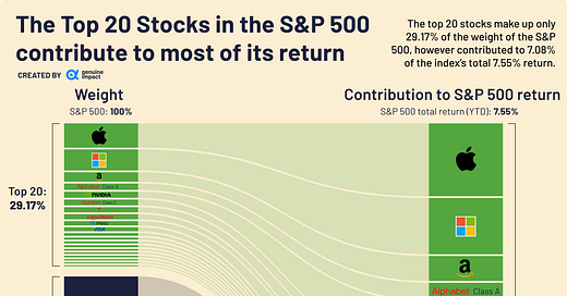
The Top 20 stocks are responsible for the majority of the S&P 500’s return
The total return of the S&P 500 YTD is 7.55%, and the top 20 stocks have contributed to 7.08% of that! This is despite the fact that they are under 30% of the weight of the S&P 500. Of the top 20, particular heavy lifters include Apple, Microsoft and NVIDIA, contributing 1.49%, 1.15%, and 1.00% respectively.
Despite difficulties the tech industry has recently been facing, with highly publicised layoffs, these companies still clearly dominate in the S&P 500 both by weight and contributions to return. In fact, looking at the top 20, only 4 are not a part of the information technology sector.
Free ETF worth up to £200*
Wealthyhood is currently running a referral scheme that allows you to get a free ETF worth between £5 and £200! Here’s what you have to do:
Sign up using our referral link
Set up your portfolio
Deposit and invest a minimum of £10 (within 7 days of signing up)
Receive your free ETF within 1-2 days!
(If you wish to sell your ETF you have to wait 60 days)
*advertising content
How do you know whether to save or invest?
We take a look at the dividend yield of the S&P 500 and plot this against the Fed fund rate. To simplify things, if the dividend yield is higher than the Fed fund rate then investing is the better option. This is because your money will earn more if you invest it rather than if you put it into a savings account and earn interest. You can see this below in the highlighted green sections.
Currently, the Fed fund rate is more than the dividend yield of the S&P 500 and the difference between the two is the largest it has been over the last ten years.
P/E history of S&P 500
The price to earnings ratio is calculated by taking the share price and dividing it by the earnings per share. Its purpose is to help determine whether companies are over or undervalued. A high P/E ratio could mean that a stock is considered overvalued, or perhaps investors are expecting high growth rates in the future.
The S&P 500 had its highest P/E ratio over the last 10 years during April 2021 at over 32. This was when we had a bull market and investors remained optimistic about stock growth.
You can find more charts about inflation, macro and markets in general:
See you on Friday with a deep dive on Tesla!
Created by Amara
This newsletter started free, and we aim to keep it free for as long as we can. However, any support is always much appreciated - feel free to buy us a coffee using the link below <3
Want to advertise your brand on our newsletter? Click below and we’ll get back to you ASAP!


Great graphs 📈 thanks for the article :)